An iconography system
Case study
My first project on the Atlassian Design System team was to look into Iconography. This was my onboarding into the design system.
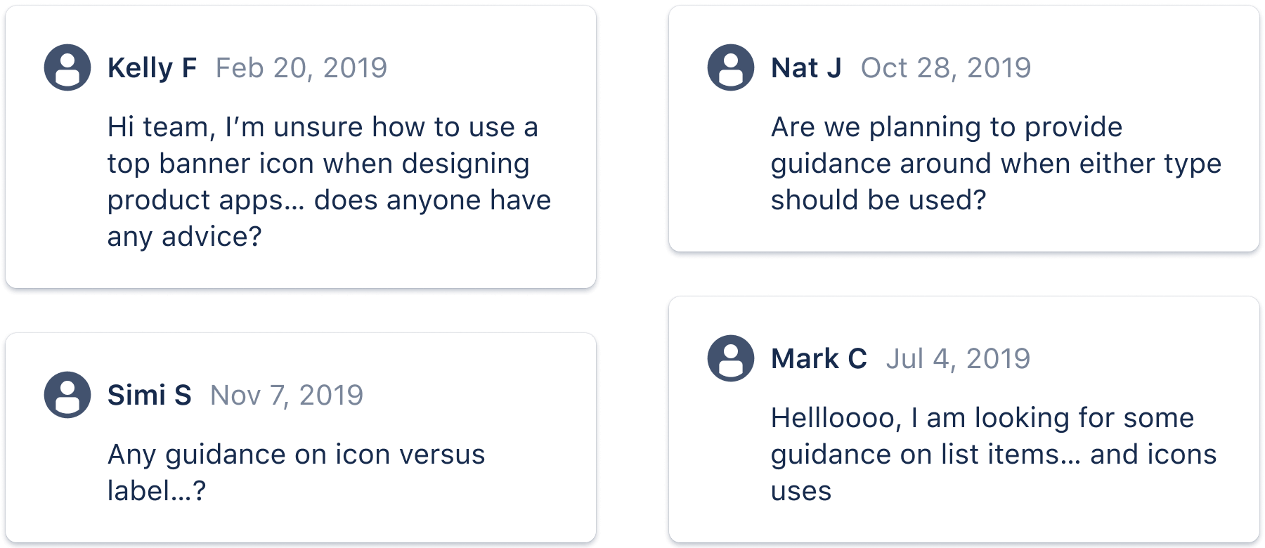
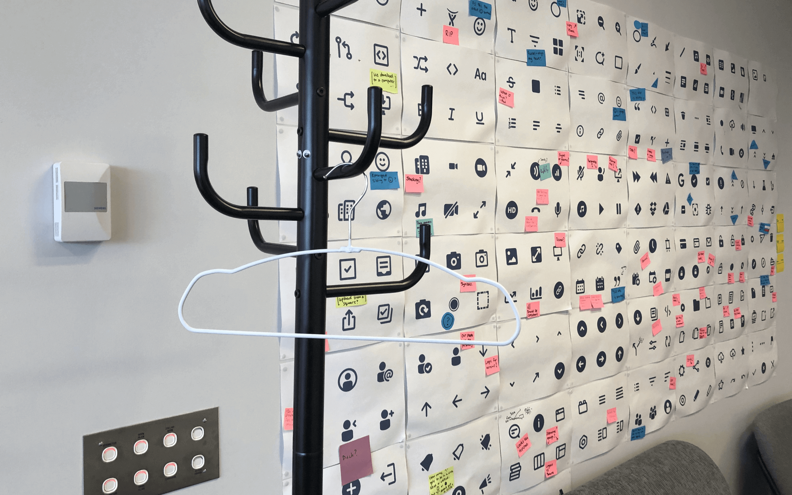
Iconography at Atlassian had been overlooked. There was 2+ years of signals that the team had been collecting – issues, Confluence pages, and a longstanding wall of feedback on our icons.
I started by investigating the problems. I conducted interviews across different teams, experience levels, and disciplines. I spent time reviewing our internal and external backlogs then categorising my findings. I also dug into Slack to track down conversations – many conversations never led to a ticket or a ticket had far more context that wasn’t captured before being created.
Speaking to our internal product teams, our primary audience, about their process and how they engage with our iconography helped gather insights into how our teams want to use icons, why our teams so often needed new icons, and what was stopping them using icons in the design system. I discovered our guidelines were sending people down the wrong path.
The insights highlighted that our understanding of how we use icons wasn’t clear. This understanding needed to be addressed first before any work to solve the inconsistencies and visual improvements started.
Atlassian Design System
Lead designer
2020
Guidance is key
A component is only as good as the guidance that explains how to use it.
— Yesenia Perez-Cruz, Expressive Design Systems
Iconography, in Atlassian’s design system, is both foundational and a component. Foundations are the visual elements that give structure to the system and Components are the reusable building blocks. We had foundational guidance – icon grids, custom curves, radius, etc – for creating an icon without any component-level guidance for how to use and apply them in-product.
The lack of guidance resulted in a confusing experience for the product teams using the design system and led to a disjointed product experience for the customer seeing the icons in the products.
To help give our teams a clear path to follow and remove as much unintentional divergence as possible, we wanted to address the right questions in our guidelines:
- What is the icon’s purpose?
- Why would an icon be the right choice?
- What does it look like in context?
- How easy it is to discern?
I rewrote our existing guidance with the new insights I’d discovered. It can be hard to get a sense of how effective guidelines are until they’re actually needed so I used support requests to send the draft guidelines as a first step in the support journey. Working this way helped gain confidence that I had the right information and could iterate with deliberate feedback.
Being intentional about iconography
Where we previously only spoke to the icon foundations of radius, angles, and curves were now coupled with component guidelines for application – how-to’s, do’s and don’t’s, and best practices for Atlassian.
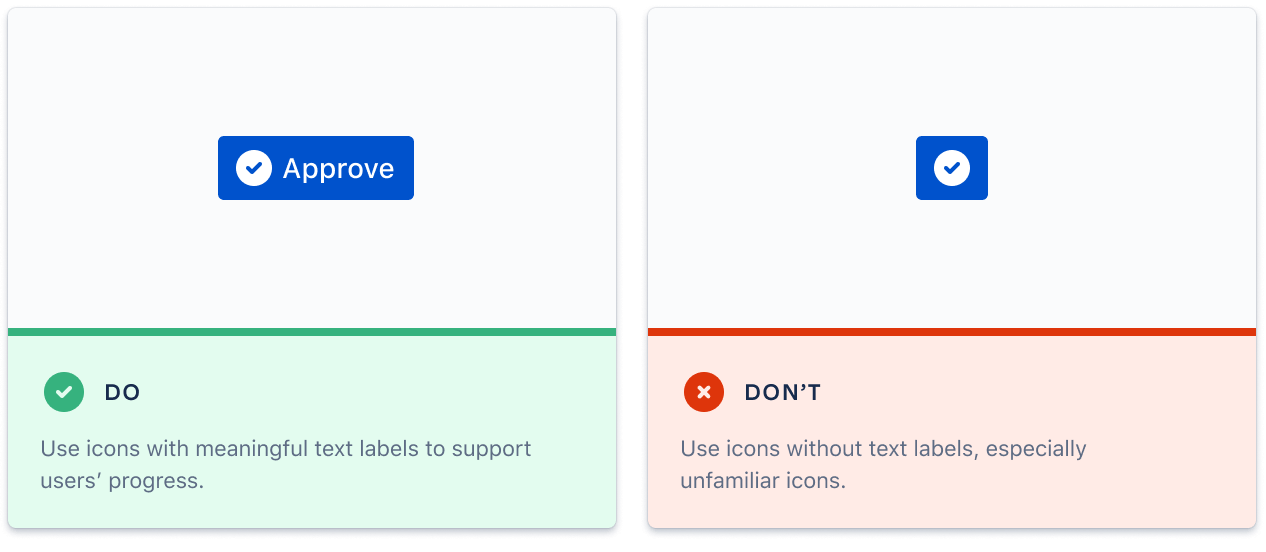
The opening paragraph, before and after, are great examples of the updates: “They should be simple, yet bold enough to grab attention, and leave a lasting impression.” now read “Use icons in a purposeful manner to maximize comprehension and reduce cognitive load when you need to call attention to a particular action, command, or section. Use them infrequently – if you’re questioning an icon’s use, it probably doesn’t need to be used at all.”
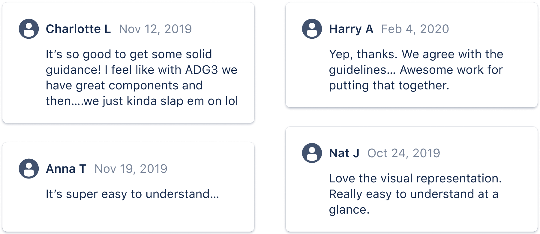
The old guidelines were unintentional and, in some cases, contradictory of how we wanted to use iconography in our products. I prioritised the guidelines to address the behaviours of our teams rather than changing the visual inconsistencies and hoping for behaviour to change with it. These guidelines were the front door for understanding and applying icons in the Atlassian way. As a design system team, we were still figuring out how to measure success across our resources and guides. I didn’t have quantitive data to show success but as a result of these changes we tracked signals – the drop in tickets and support requests relating to iconography to practically nothing, along with the majority of our new icon requests being resolved through guidelines rather than icon creation. These resolutions were now reached through low-touch support or even self-service, rather than high-touch, individual efforts. We had plenty of qualitative feedback around the guidelines too.
The team were now more confident that our consumers had support around icon usage – when to use, how to use, and accessibility guidance… but the longstanding wall of visual feedback still lived on. Our clearer guidelines gave me confidence to address the visual design of our iconography.
Redesigning our icons
Our iconography set consisted of almost 600 icons. This was too many icons to need, especially considering icons' new role as support rather than being the star of the show. An important element of any design system is knowing there is a single source of truth. To add insult to injury, our codebase and design libraries were out of sync so that number was even higher.
I sorted through every single icon, with the help of my design team, identifying duplicates and deprecation candidates. I worked with product designers to align on these deprecations/duplicates, and when necessary, paired to consolidate their icons, keeping track on a page to keep everyone in the loop.
With a smaller number of icons to deal with, I generated a small list of our most commonly used and most complex icons (product-specific) to start working with. Upfront, I wanted to know that any icon system we established would be able to stand a chance against the intricacies of our products and the icons we use. I created a brief and engaged a professional iconographer to execute the set and work with to address issues of congruence, sizing (and re-sizing), flexibility, and stylistic questions.

Fill vs. stroke
Stylistically, this is a decision about visual weight but dig deeper and it becomes a question about recognition. For example, does an icon, filled or stroked, indicate “active” or “inactive” to people? At Atlassian, this convention has not been established bar a few interactions across key products. We opted to use stroke whenever possible, as filled icons are often too heavy in our UI.

Consistency
Some icons are the same in intent, but not consistent in look. Icons that are used as the same action, such as leaving a comment or adding a date, but look quite different. Whenever possible, considering our new guidance, we’d consolidate these into one account and use text labels to make that intent clear and icon consistent.

Practical… with a wink?
A question that we also revisited was icons and our brand. Historically, our brand personality had made an appearance in our iconography (as well as the overall system) – “bold, optimistic, and practical with a wink”. Our icons have gone back-and-forth between functional and friendly and we wanted the new icons to have an opinion. While our icons have always erred on the friendly side, we wanted to ensure our icons were “used in a purposeful manner to maximize comprehension and reduce cognitive load”. We wanted to keep these icons as simple and as useful as possible.
For example, our camera icon felt too plain. After adding extra detail, we stripped the icon back and used asymmetry to add some subtle personality. That’s not to say they’re void of a human element; it’s just more subtle.
Throughout the creation process, the iconographer and I worked through multiple rounds of sparring and feedback. We worked with products and our Brand team to check-in and get our icons into real-world situations. Our Tooling team was able to put together a beta library that allowed (1) products to use the icons for their real-world designs, and (2) the Design System team to get valuable feedback before shipping – the type of feedback you can only get when you allow explorations for products on real interfaces, with clear examples to show where they do and don’t work.
No clear measurement
Cross-functional teams might have helped better measure the success of this work, such as Content measuring how useful guides are – the efficacy of the guideline itself rather than the consequences of them.
Atlassian’s new iconography set
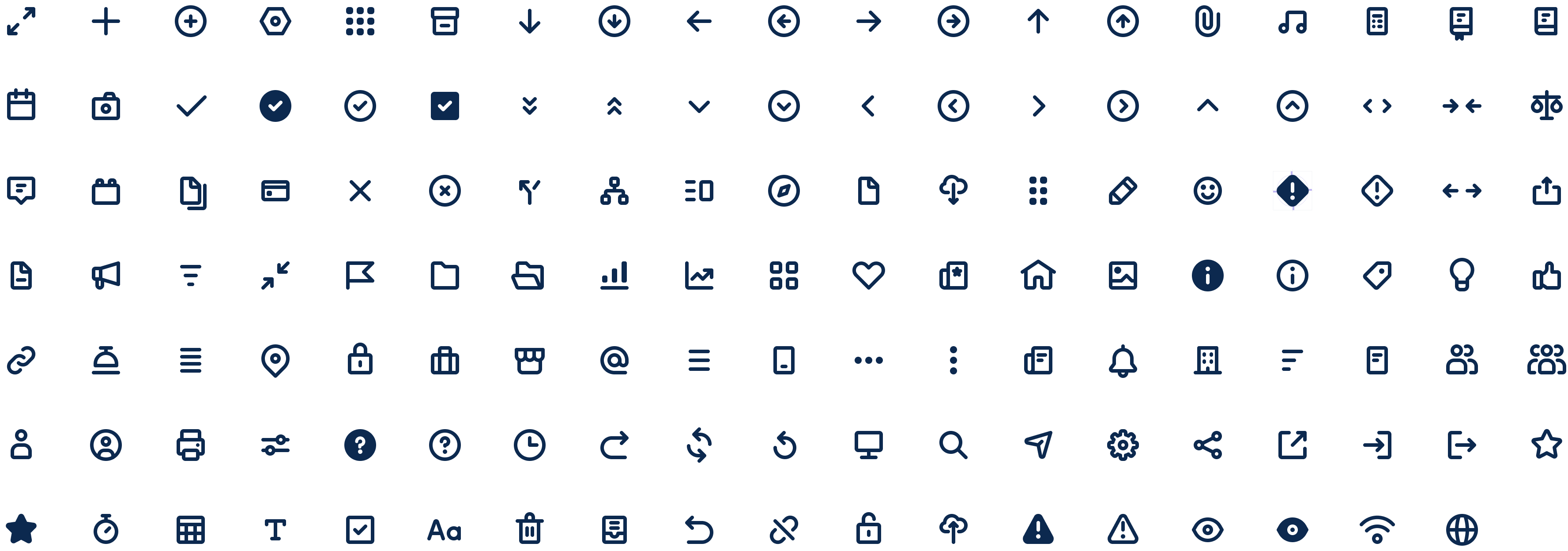
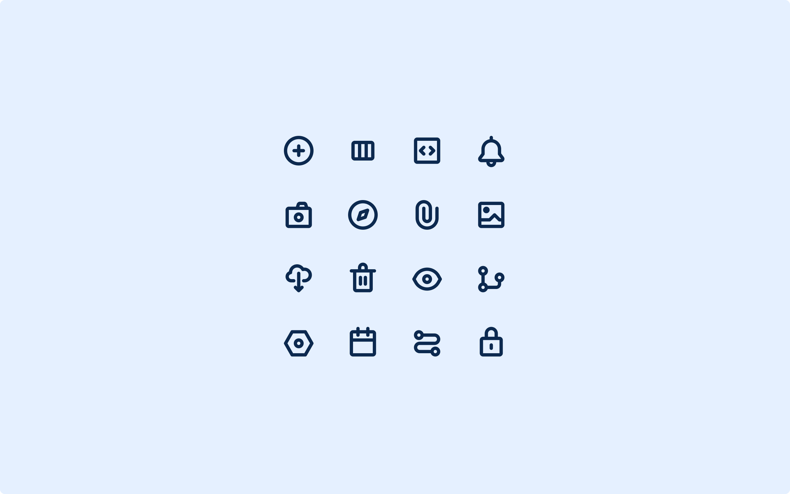
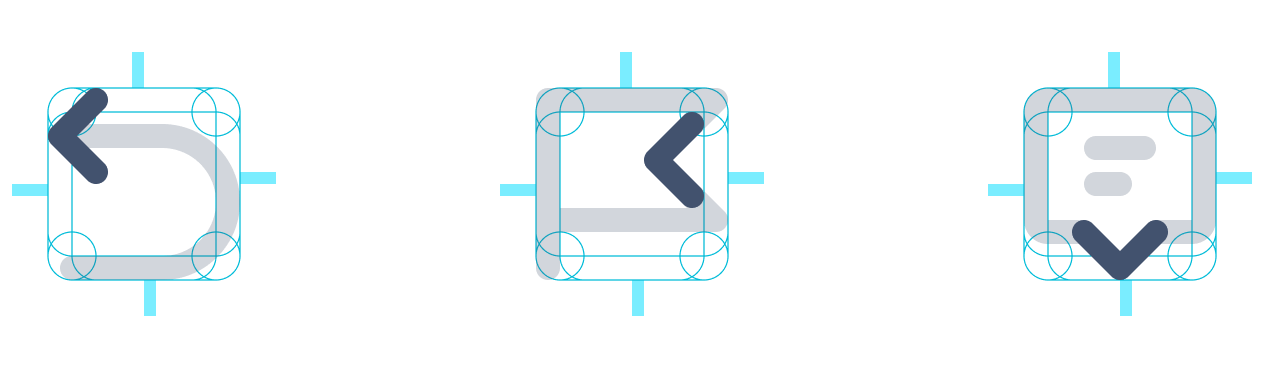
Looking at iconography holistically, our design system now had clearer guidelines speaking to structure, application, and accessibility to pair with a manageable, consistent icon set to work with. I’d reduced the number of icons in the system to ~250, down from ~600, with an established style and system. The paths of our icons are reusable to help with consistency and conformity to the set. Where possible, we’ve used established paths from existing icons, like building blocks — they make creating a new icon more straightforward, but more importantly, create a cohesive iconography system.
With the new designs, almost all of the visual feedback issues from the crit wall and backlogs were completed and questions around iconography ceased. Products were excited to start using them, and our Brand team initiated a project to refresh their Marketing icons using our new set as the base.
On the side
Along with the design updates, I needed to consider the workings of the wider system. I borrowed time from my team when they could spare to help inform the creation of naming conventions and metadata usage across Figma and our icon explorer as well as depreciation plans, estimations, and readying the work.
Lessons learned
The new icons were not fully integrated into the system due to some re-prioritisation. The icons not being in the system meant that adoption of them was low, however, there are more products making use of the icons and the icon system when our current set no longer meets their needs.
As an introduction to the team, I investigated this work in isolation. There were a couple of key factors driving this – my skillset coming into the team, competing priroities for engineering who were heads-down on an engieering-wide initative for the business, and budgets to be used. As the work progressed, it became imperative to onboard and work with developers which didn’t happen until it was too late. When weighed against business priorities, work such as this often lose out. Evangelising the benefits at scale for this work while driving home the small amount of work we'd estimated might've helped our team get this work roadmapped.
(Coincidentally, one of our Atlassian Design System principles reflects this learning, bringing people on the journey before helping for the moment. You can read about the creation of our principles here ↗.)
The Atlassian Design System team are in the process of overhauling the Foundations of the design system, and iconography is being addressed within that initiative. While I’m no longer on the team, it’s exciting to know the work can still be utilized and have an impact.